The Least Trustworthy Numbers Are the Biggest Ones
Inside InvaCost, the world's biggest database of invasive-species costs, the shakiest estimates run roughly 40 times larger than the best-documented ones — and a tiny fraction of giant, often suspiciously round records drive almost the entire $5.49 trillion recorded total.
The Reliability Paradox
Here is the paradox at the center of the world's biggest database of invasive-species costs: the shakiest estimates in it are, on average, roughly 40 times larger than the solid ones. InvaCost tags every one of its 13,344 cost records as either “High” or “Low” reliability. The typical High-reliability record is worth $65,713. The typical Low-reliability record is worth $2,624,671 — and the gap is not noise (Mann-Whitney p=1.9e-126, rank-biserial r=0.439, an effect size as large as anything else in this database).
That is backwards from what most people would guess. Shakier evidence is supposed to hedge toward caution, not inflate toward spectacle.
It isn’t that low-reliability estimates are wrong in a random way. It’s that InvaCost’s least rigorously sourced numbers skew toward big, round, extrapolated figures — the kind of number a report reaches for when nobody actually measured anything — while its carefully documented numbers tend to be smaller, more specific, and more mundane.
Thirteen Thousand Price Tags
To understand why that paradox matters, it helps to know what InvaCost actually is.
InvaCost is a literature-compiled database built by a team led by Christophe Diagne, Boris Leroy and Franck Courchamp, first published in 2020 and now in its fourth major revision. The version analyzed here, v4.1, holds 13,553 cost estimates; restricting to records with a usable positive cost — the same filter the original analysis applies — leaves 13,344 records spanning 216 countries and 1,228 named species, each one a single dollar figure pulled from a peer-reviewed paper or a government report and converted into a common, comparable unit: standardised annual cost in 2017 US dollars.
Every record in that pile is hand-extracted from real-world literature and tagged along several axes at once — whether the cost was actually observed or merely projected, whether the invasion struck land or water, whether the money went to cleaning up damage or trying to prevent it. Those tags are what let researchers ask sharper questions than “how much do invasions cost” — questions like the three this piece walks through next.
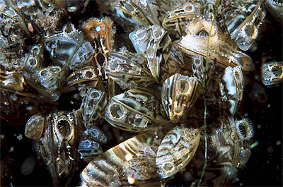
The stakes are not abstract. A 2023 intergovernmental assessment (IPBES, approved by 143 member states) put the global cost of invasive species at more than $423 billion a year as of 2019, rising roughly fourfold every decade since 1970, and found invasive species have played a role in 60% of the world's recorded plant and animal extinctions.
What Might Happen vs. What Did
The database's own headline finding holds up under an independent re-download and re-run: costs tagged “Potential” run vastly higher than costs tagged “Observed.” The typical Observed record is worth $46,488; the typical Potential record is worth $2,843,254 — roughly 61 times larger (bootstrap 95% CI on the ratio implies 48-75x), and the gap is about as statistically decisive as it gets (p=4.6e-266, rank-biserial r=0.449).
The distinction matters enormously and is easy to blur: “Observed” means a cost that was actually incurred and recorded — money that changed hands. “Potential” means a modelled projection, often built to answer “what would this cost if nobody intervened” — a fundamentally larger, far less constrained question. Any total that quietly mixes the two will be dominated by extrapolation, not by measured reality.
The Observed category is itself lopsided: its mean cost ($448.7 million) is 9,652 times its median ($46,488), because a single record — worth $532.9 billion on its own — accounts for nearly 11% of every Observed dollar in the database. A “typical” observed invasion cost and “the observed total” are, in practice, describing two very different worlds.
The Bill for Doing Nothing
The starkest of the three pre-registered contrasts is also the cleanest: the typical Damage record ($3,934,567) is about 194 times larger than the typical Management record ($20,300) — 95% CI [162, 240] — with the largest effect size in the whole analysis (rank-biserial r=-0.669). Put plainly: within this database, the disease costs vastly more than any attempt at the cure.
It is tempting to compare that 194x figure to the field's most-cited aggregate numbers — the original InvaCost team's own 2021 Nature synthesis found realised damages were roughly 10 times management spending by 2017, and the 2023 IPBES assessment split the global $423-billion annual total 92% damage to 8% management, an aggregate ratio near 11.5x. Those numbers and this piece's 194x are not competing estimates of the same fact. One sums every dollar in a category and compares the sums (a number a few gigantic records can dominate); the other asks what a single typical record looks like. Both are real. They are just answering different questions.
The pre-registered test itself only compares two of four cost-type tags. A third category, “Mixed” — records that blend damage and management spending into one reported figure — covers just 4.2% of records but 17.9% of all recorded cost, more than four times Management's own dollar share. The clean 194x headline describes 95.0% of records but only 75.7% of the money.
Land, Water, and the Records In Between
The third pre-registered contrast is the weakest of the three by a wide margin. Terrestrial invasions do carry a higher typical cost than aquatic ones — $107,343 versus $33,857, a 3.17x ratio — and the difference clears an extremely low p-value (2.5e-9) simply because the sample is so large. But the effect size (rank-biserial r=-0.09) is small: knowing an invasion happened on land versus in water tells you comparatively little about how big its cost record will be.
That modest 3.2x sits oddly next to an external benchmark: a companion 2021 study isolating aquatic invasive species found they make up roughly a quarter of all documented invasive species worldwide, yet only about a twentieth of total recorded invasion cost — an aggregate asymmetry closer to 20x. Once again, a per-record median and an aggregate total are telling two different stories from the same underlying phenomenon.
There's a third story the Terrestrial-vs-Aquatic test doesn't tell at all. The Environment field has eight tags, not two, and the 519 records marked “Aquatic/Terrestrial” — invasions that don't cleanly belong to one realm — carry 44.3% of all recorded cost, more than pure Terrestrial's 37.9% despite having twenty times fewer records. The pre-registered test's two clean categories cover 89% of records but only 39% of the money; the biggest single slice of cost in the whole database belongs to the category the test leaves out.
A Trillion Dollars, Mostly From 133 Rows
Every gap this piece has shown so far — 61x, 194x, 3.2x, 40x — has the same underlying cause, and it's worth pulling back the curtain on it directly.
Recorded cost in InvaCost is extraordinarily concentrated. The single largest of the 13,344 records is 9.7% of the entire $5.49 trillion total on its own. The ten largest records combined are 44.0%. The largest 1% of records — 133 rows out of 13,344 — account for 89.9% of every recorded dollar. The bottom half of all records, more than 6,600 of them, add up to just 0.0018% of the total.
That single fact — 133 rows carrying nearly 90 cents of every recorded dollar — is the real engine behind this whole database. It's why means and medians disagree so violently, and it's why the group comparisons in this piece are built on medians and rank-based tests rather than sums or averages, which a handful of outsized entries would otherwise dominate completely.
It also connects directly to a documented problem with InvaCost's underlying data quality. A 2023 audit of the database found that reported costs depart from Benford's Law — the statistical pattern real, unrounded financial figures should follow — about as much as known cases of manipulated economic data, with heavy “numerical heaping”: just 901 unique values account for half of the database's cost estimates, and no matter the currency, $1,000,000 is the single most common reported figure. Checking that claim directly against an independently re-downloaded copy of this exact data confirms it precisely: 213 records — 1.6% of the whole database — report exactly $1,000,000 in their original currency, more than any other value, and only 55% of raw reported figures are unique at all.
Even the database's shape over time carries this same fingerprint. Summing recorded cost by the decade an invasion is estimated to have started shows a sharp jump in the 2000s — but just five records, out of that decade's 3,482, account for 44.7% of the entire decade's total. A handful of enormous entries, not a smooth economic trend, drives the shape of that chart, and it should be read as suggestive at best, not as a rigorous replication of the field's published temporal trends.
One Country, One Termite, One Category Called “Unspecified”
The same concentration shows up again and again, no matter which lens you use to slice the database.
By country, the United States alone accounts for $2.68 trillion — 48.7% of every recorded dollar worldwide — and the ten largest country tags combined cover 96.7% of the total, leaving 202 other countries with any recorded cost to split the remaining 3.3% between them.
By species, one insect stands out from all 1,211 named species in the database: Coptotermes formosanus, the Formosan subterranean termite, accounts for $275.9 billion in recorded cost — 5.0% of the entire database — from just 67 records. A small, wood-eating termite has a bigger recorded price tag than 202 of the 212 countries with any recorded invasion cost combined.
By taxonomic kingdom, 6.5% of records — the ones too mixed or unattributed to tag to a single kingdom — carry 58.8% of all recorded cost. Named animal-caused costs (Animalia) account for another 24.6%, while named plant-caused costs (Plantae), despite being the single largest category by record count, contribute just 7.1%.
That taxonomic split holds up even away from the extremes: comparing every record cleanly tagged Animalia against every one tagged Plantae, the typical animal-caused cost ($312,497) runs about 34 times higher than the typical plant-caused cost ($9,108) — a gap nearly as large as the reliability paradox this piece opened with, and one that isn't an artifact of a handful of giant outliers.
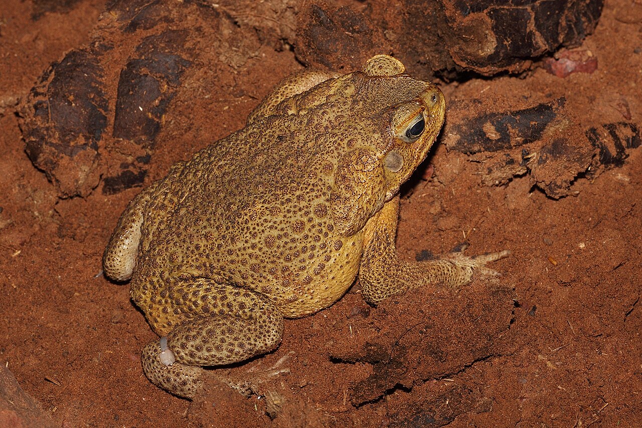
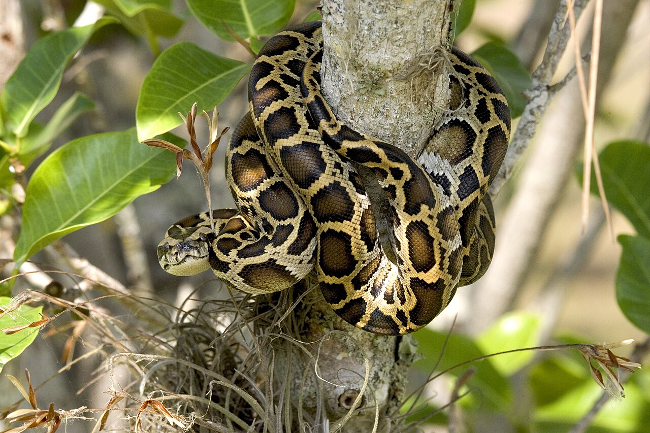
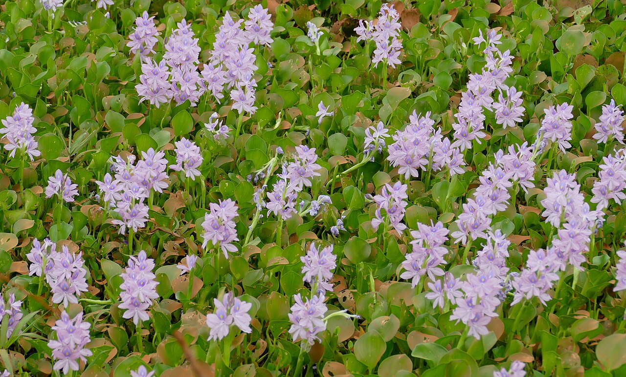
By region, the pattern inverts in an interesting way: North America holds only 13.6% of records but 49.8% of recorded cost, while Europe holds 40.0% of records — the single largest share by volume — yet only 3.1% of the money. More records does not mean more dollars; it can mean the opposite.
How to Read a Number Like This
None of this means InvaCost is untrustworthy, or that biological invasions aren't genuinely, enormously expensive. It means a database built this way — from a small number of huge, unevenly reliable entries sitting alongside a much larger population of modest, well-documented ones — cannot be reduced to a single honest headline number.
The next time a $423-billion-a-year or $1.288-trillion-since-1970 figure crosses your feed, the useful question isn't “is that true.” It's “which 133 rows is that built from, and were they measured or guessed?”
These are analyses of recorded costs in a literature-compiled database, not measurements of the true economic burden of invasions. InvaCost has documented reporting, geographic, taxonomic, and language biases; regions, taxa, and sectors with more recorded cost are partly a signal of what has been studied and monetised, not necessarily what has been most damaging. All group comparisons above use medians and rank-based tests rather than means or sums, precisely because a handful of outsized records would otherwise dominate any average.